
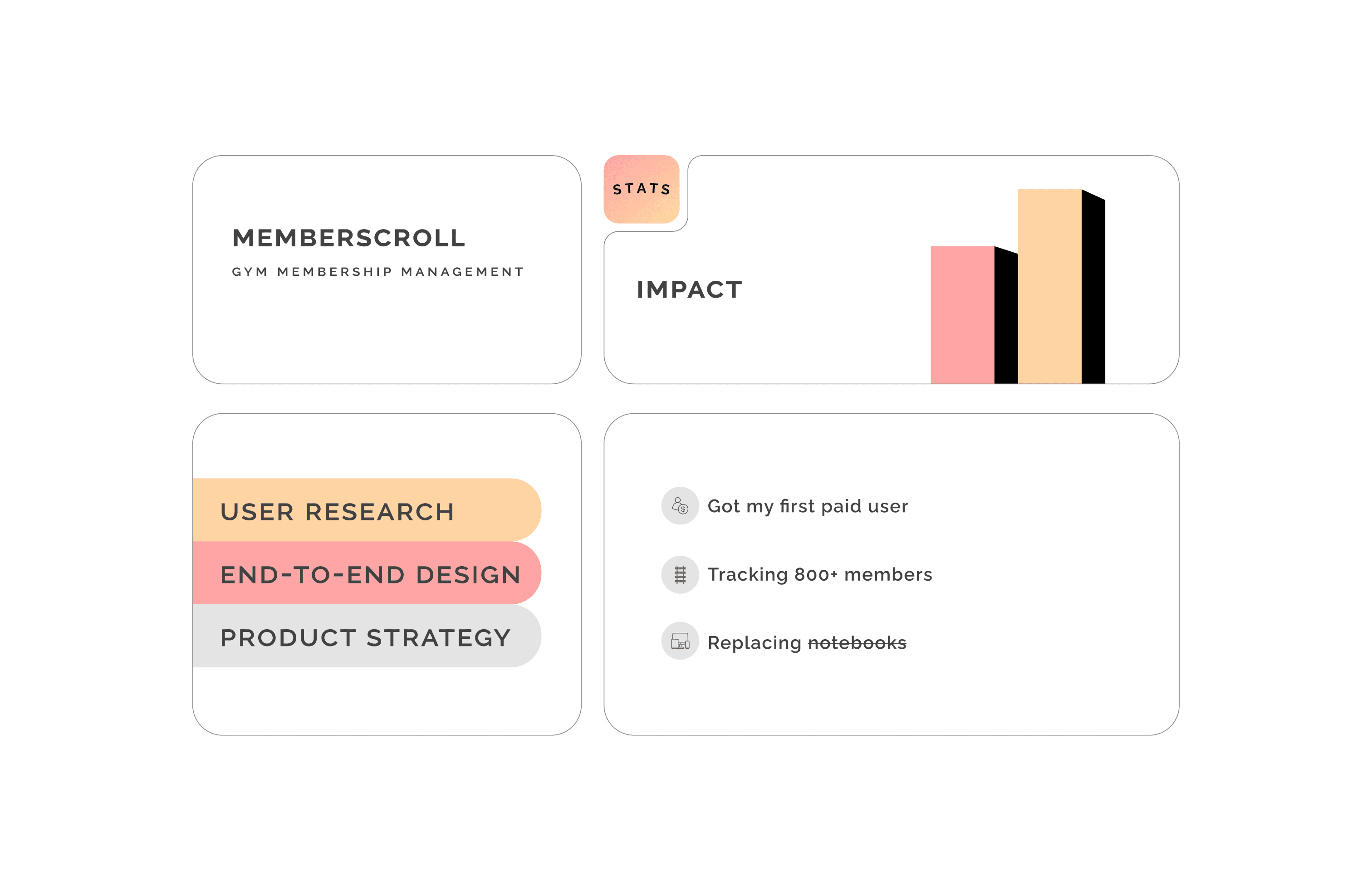
MemberScroll
Why is it so hard to find simple apps for big use-cases? Why aren’t things being built as much for so many niches, like it is being built for tech people? Why are many apps jam-packed with features that a user don’t find the need for? Why do “awesome” features sometimes make it harder for users people, to use the app?
Why can’t things be, um I don’t know, just be SIMPLE!
Have you ever been to a class that required monthly payments or ever had a gym membership (I guess we all do at some point :P) ?
2021
Software
$ 200 ARR
2
Challenge
Have any of you independent gyms or small membership based businesses (tuitions, dance, yoga, music, etc classes) faced the issue of tracking memberships? I went to one such independent gym, amazing trainer and gym :) He is so incredibly passionate about his gym and members, but he had one major problem.
What issues did he face?
Didn’t have time to use bloated gym apps
Too expensive for his independent business
Most apps not mobile-friendly owing to the too many number of features
His gym wasn’t a franchise, didn’t need to collect a lot of data from members
Simply not simple enough to use :(
Results
You’re probably using excel, sheets, or a “too many things going on” app? Do you ever feel that it simply doesn’t cater to your needs, either it is not made for you or it is loaded with things you’re never gonna end up using and carry this unsettling feeling of incompleteness?
You just wanna DECLUTTER your workspace (i.e the app that you’re using)?
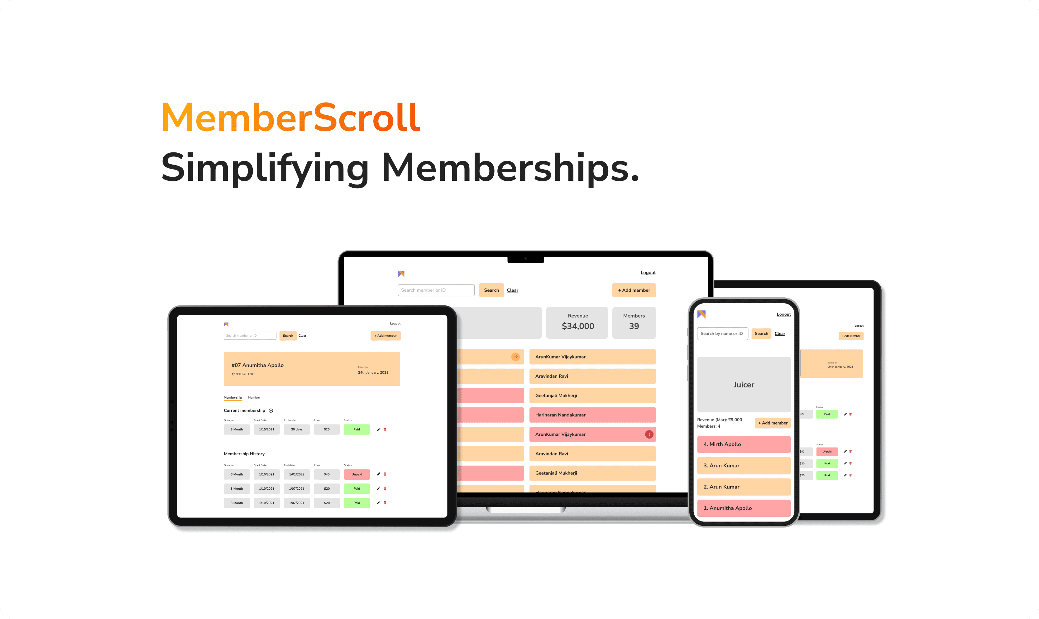
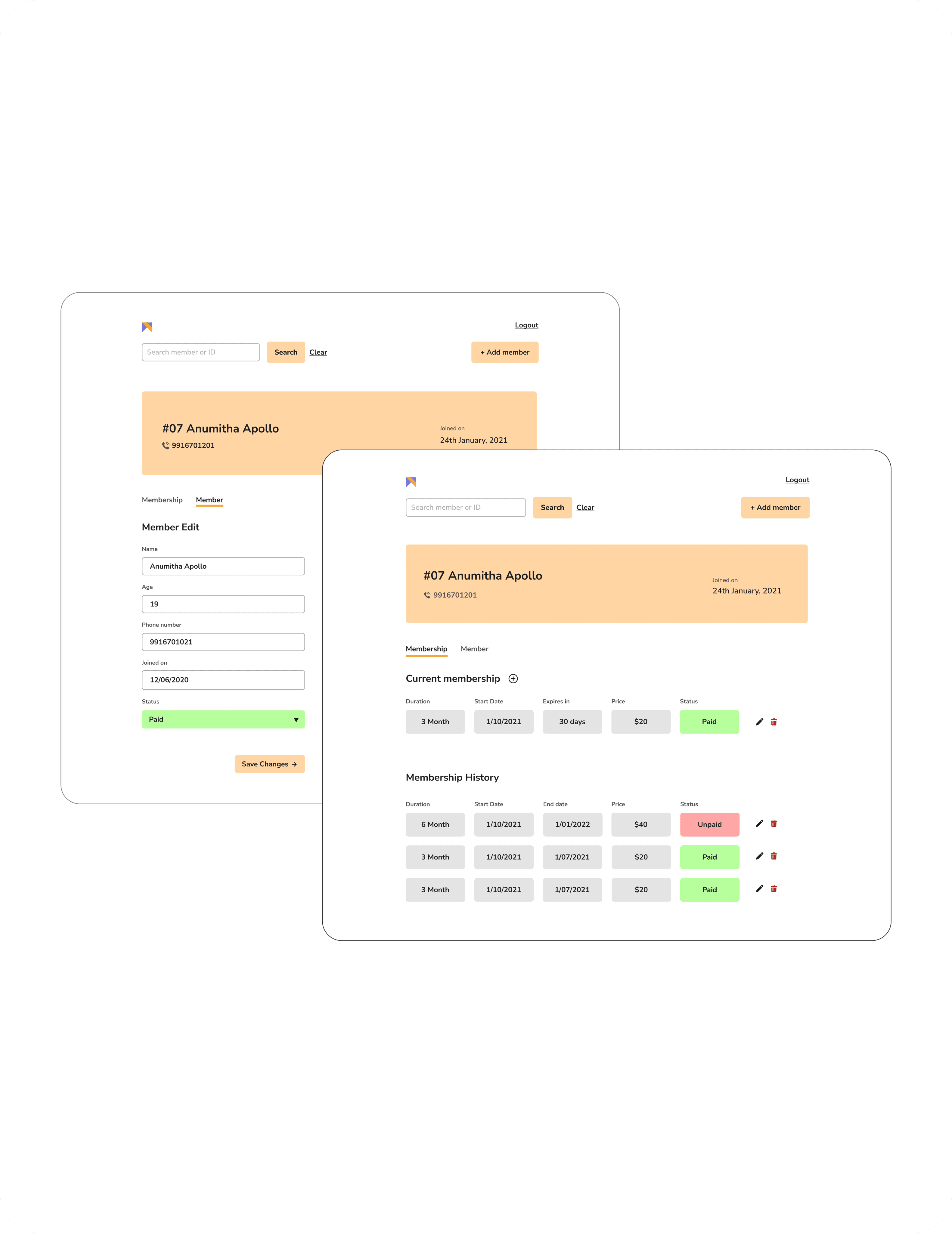
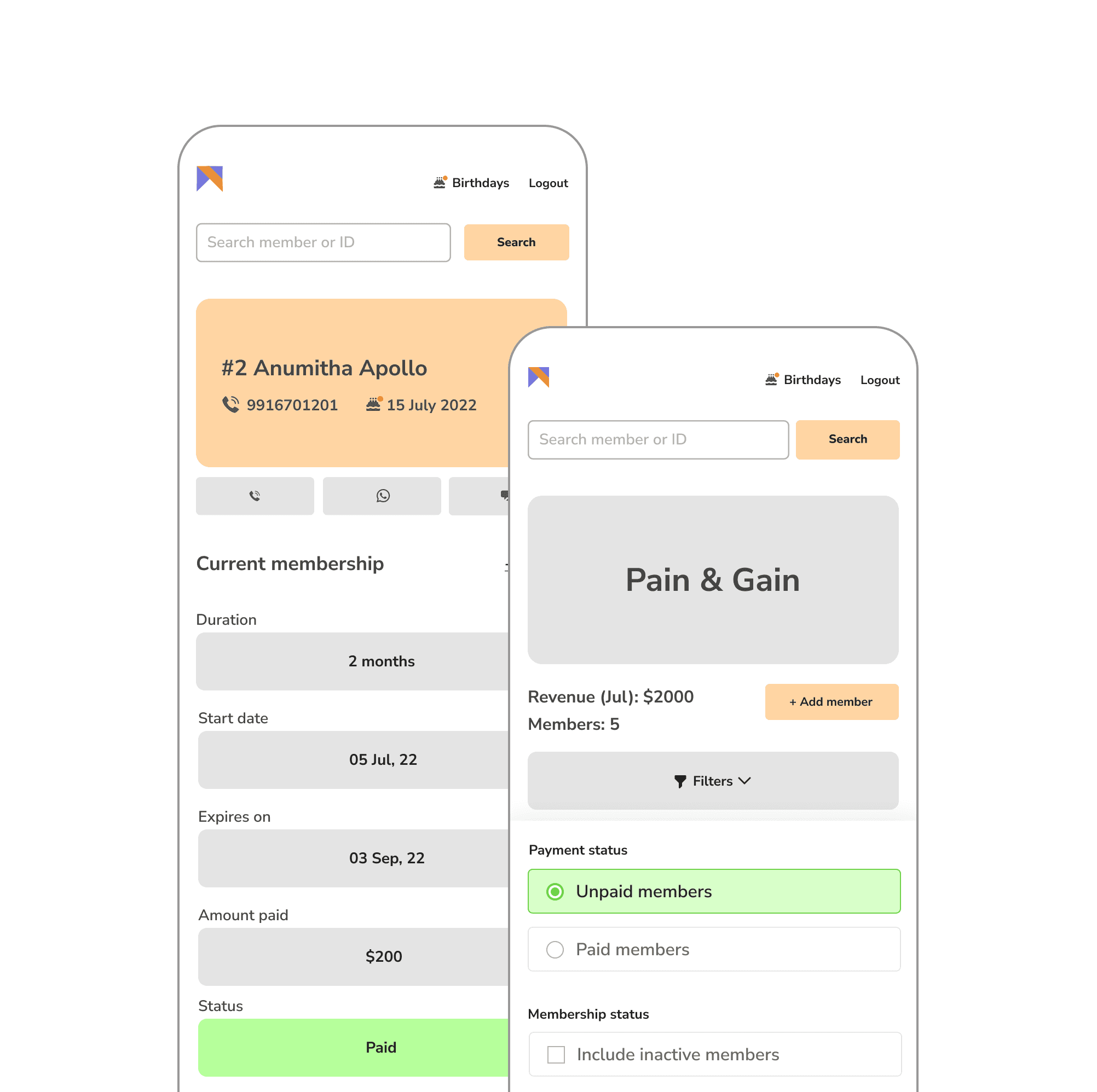
Ta-da I bring you **Memberscroll.com,** built for simple, small Independent businesses.
No more notebooks, excel, sheets, managing memberships and payments made simple.
20%
Conversion rate
100%
Increase in user retention
5.0*
User Satisfaction
Process
Research & Analysis: We conducted user interviews, surveys, and analyzed in-app analytics to understand the pain points and user needs. We also studied competitor apps and industry trends to gather insights
Information Architecture: Based on the research findings, we restructured the app's navigation and content, prioritizing features and information according to user needs.
Wireframing & Prototyping: We designed low-fidelity wireframes to visualize the new layout and navigation, iteratively refining them based on user feedback. Afterward, we built a high-fidelity, interactive prototype to test the design.
Usability Testing: We conducted usability tests with a diverse group of users to validate the design and identify areas for improvement. Based on the feedback, we made necessary adjustments to the design.
Visual Design & Style Guide: We developed a cohesive visual language, including color schemes, typography, and iconography, ensuring consistency throughout the app. We also created a style guide to maintain design consistency in future updates.
“ This app has made my life so much more simpler! I spent hours on my notebook but now everything is just a click away, and saved all of my time. Now I can focus on what I really want to do, my gym ”

Xavier
Founder | Pain & Gain Gym
Conclusion
The StreamLine mobile banking app redesign successfully addressed the usability issues, resulting in a more intuitive and user-friendly experience. The improved UX/UI design led to increased user adoption, engagement, and satisfaction, demonstrating the value of a well-designed template for UX designers.